Are Low-Fidelity Wireframes Still Necessary?

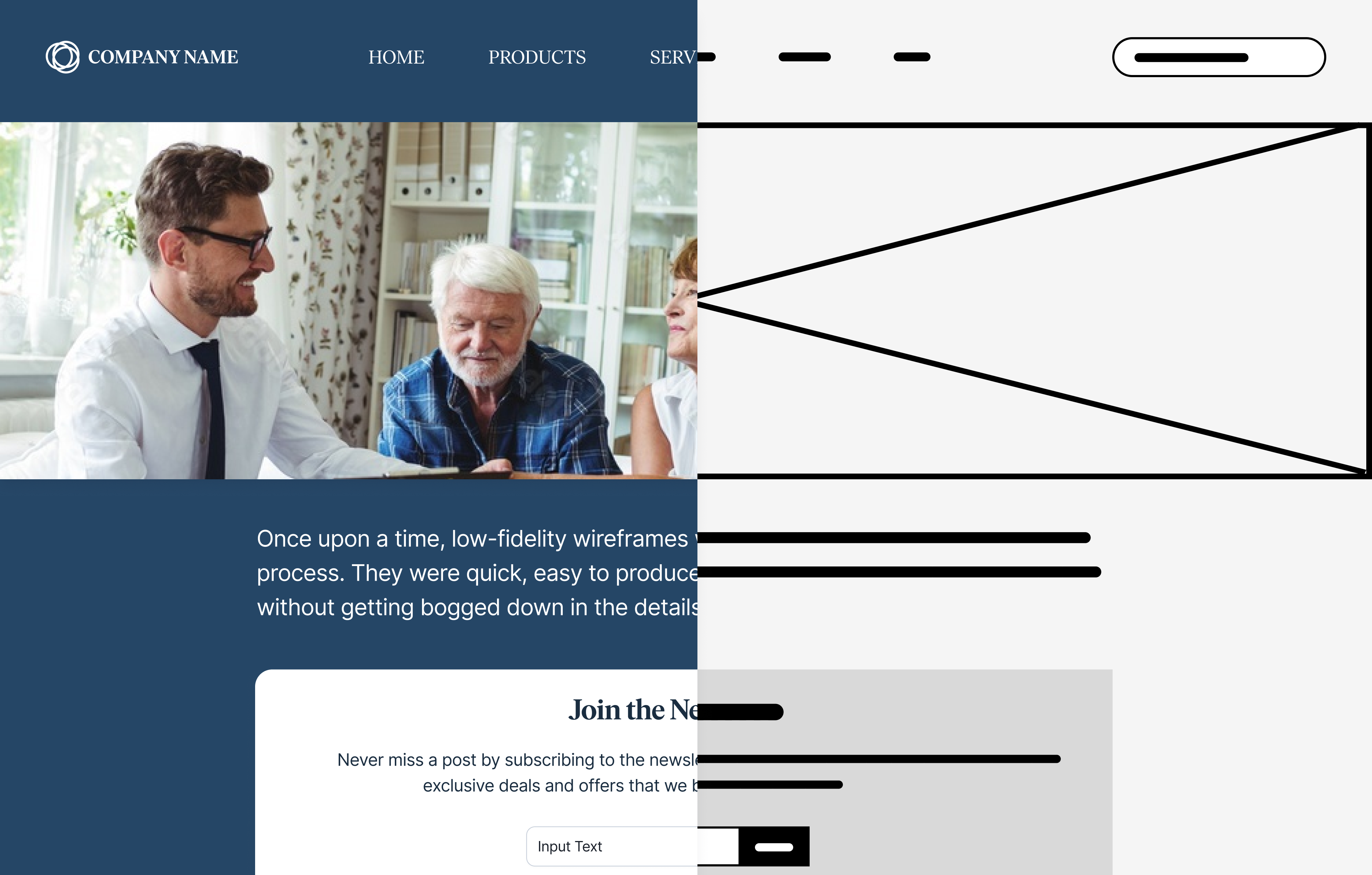
Once upon a time, low-fidelity wireframes were the backbone of any design process. They were quick, easy to produce, and a great way to brainstorm ideas without getting bogged down in the details.
But here’s the thing: design tools have evolved, and so has our workflow. With platforms like Figma and the rise of robust UI kits and design systems, the need for these bare-bones sketches is starting to feel a bit outdated. Let’s dive into why low-fidelity wireframes might not be as essential as they used to be, and how making something that looks and feels real can actually lead to better results faster.
The Case Against Low-Fidelity Wireframes
Whenever I've used a wireframe to get a point across, I've had to spend a lot of time saying things like, “Imagine this as a button,” or “This part here will be a menu.” This context may be obvious to you, but to the person you're sharing with there is a lot of imagination required and even if the person "gets it" (and many still won't), what they "get" may be different enough in understanding to make the conversation frustrating and confusing. You may get speed, but you may be off the mark enough to cause more reconciliation of vision down the road.
Now, with tools like Figma, we can skip that guesswork. Instead of a black-and-white boxy sketch, we can create something that looks and feels real — something that’s much closer to the final product. When stakeholders see a more polished design, they don’t have to imagine how it might look down the line; they see it. This shift from abstract to concrete helps communicate intent more clearly, bridging the gap between designer and stakeholder.
The Benefits of “Real-Feeling” Designs
Being able to see something that looks real can cause a different set of challenges, but overall the benefits outweigh the drawbacks. Here are some of the benefits of creating something that feels real as quickly as possible:
1. Clarity of Communication: When a design looks real, there’s less room for misinterpretation. People can see how elements interact, how they’re meant to behave, and even how they might feel in a real-world scenario. This helps stakeholders make informed decisions faster because they’re not left guessing or trying to interpret abstract shapes and lines.
2. Better Quality Feedback: A more realistic mockup invites more actionable feedback. When people see a fully realized design, they’re more likely to focus on how it actually works and feels, rather than getting stuck on conceptual details. This kind of feedback is invaluable because it gets straight to the heart of the user experience, which is what we’re all aiming to improve.
3. Faster Iterations: The ability to quickly whip up something that feels real means we can iterate faster. Instead of multiple rounds of feedback to move from a low-fidelity wireframe to something closer to the final design, we’re able to present a more polished concept from the start. This shortens the feedback loop, allowing us to make meaningful changes more quickly.
4. Enhanced Collaboration: Tools like Figma offer real-time collaboration, meaning you can work with your team or stakeholders directly in the design. You can make tweaks on the fly, adjust components, or test different UI elements together. This real-time collaboration fosters a more inclusive and efficient design process.
But Aren’t Low-Fidelity Wireframes Quicker?
In this day in age, in most cases the answer is no. Many teams I've worked with operate from a reasonably mature design system built in a Figma library or equivalent. To grab low fidelity components to use instead would require building and maintaining an entire second library of components which is cost-prohibitive.
Of course, there are still scenarios where low-fidelity visuals have a role to play:
• Team Collaboration: Many teams spend time together virtually "whiteboarding" in tools like Miro and these tools are not equipped with the mature libraries we'd use in other tools.
• Flow and System Diagrams: I generally am also not much of a fan of these (more on this in another post), but there are situations where they are still useful and relevant. Sometimes a crude visual is helpful context instead of just text in a box.
• Hand Sketching or Paper Prototyping: I'm not sure these technically count as "wireframes" but since the output looks similar I felt it applied. Sometimes drawing concepts or flows by hand is far quicker than taking the time to build it in the real components.
In a world where tools like Figma and design systems make it easy to create high-fidelity prototypes quickly, there is no longer a need for low fidelity wireframes in the majority of cases. While there are situations where they still serve a purpose, the ability to create designs that look and feel real from the outset is transforming how we communicate ideas, gather feedback, and iterate on our designs.
By skipping the low-fidelity phase, we can often communicate more effectively, get higher-quality feedback, and move faster — all of which are critical in today’s fast-paced design landscape.

